Tuesday 11 January 2011

Band Evaluation

Before the unit, I had only ever worked with Photoshop before. Although I didn’t have much experience with the programme I felt competent in most of its basic tools and abilities. Throughout the unit, I grew in confidence using a multitude of software I found the fake band task the most enjoyable as we were given complete freedom in what we created. Skills wise, I learnt most from the animation task as this is something I have never worked with before. Learning about new tools in Photoshop has helped me a lot during this unit, learning about free transform, clone stamp; magnetic lasso’s etc has made me incorporate them into my work and ultimately allowed me to create far more professional and better looking products.

Starting this unit I knew very little about specific file formats. I have learnt that when searching for images on the web or saving to file it is advisable to find the largest image, these are usually Jpegs and have the most quality. I have used different file formats in order to make sure my work was displayed successfully and as professional as possible, I used GIF’s, JPEG’s and PSD files and had to experiment and research in order to find out which one is most effective.

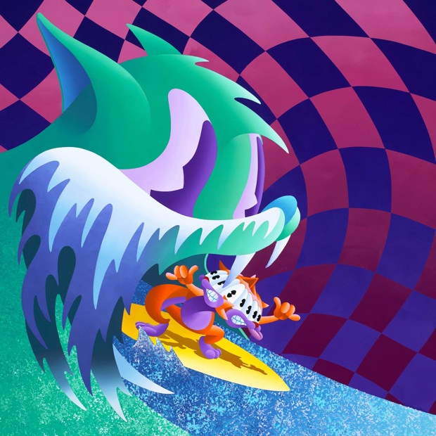
Out of my two products I feel that the album cover I created is the better. I believe this because it is a completely original idea of my own, It also took me a while to complete as I kept changing my ideas and decisions as the weeks progressed. I finally settled on an idea and started to work on it. The cover I have created represents the band genre’s well and is different to all of those I researched. The cover is quite abstract and quite alluring; it would grab my audience’s attention and draw them in. Although it is quite simple in the way it looks, It was a task to finish, I had to spend time intricately drawing out the shapes and moving them around as well as finding the right fonts, colours and textures to fit it in the most appropriate way.

Too improve; I would work on my magazine cover more as I spent most of my time trying to finalise my first product, If I had more time I would work on my magazine, looking at the colour, and layout aiming to improve it and make it look as more realistic as possible. Also I set more time aside and create my own magazine and news stories to accompany it, this I believe would earn me more marks and build up towards a better looking final product.

Throughout the course, I have thoroughly enjoyed Digital Graphics and with more practice and projects it would be something I would consider taking further to a career ideally in Graphic Design with music, i.e. creating covers for bands as well as music promotion posters etc.
 

Creating Our Own Band

For the final assement of this unit we had to create two or more products for a fake band, these could be album covers, web banners,adverts,magazine articles or various other products, we also had to create a bibliography and write a evlauation at the end of it.

The first product I chose to make was a cd front and back cover. I had researched covers of the genres my band fitted into and I decided to just start with a base image and just work my way up.  


I then spent time creating circle layers which when certain ones where removed it would reveal certain parts of the background.


I then added filter affects and text


I then used the colour sampler tool to get the same colour on the back I added another edited picture and the same font used on the front to finish my cd cover.


For my magazine article I used the clone stamp tool with a picture I had created to extened it as a back ground I then added font and pictures from the offical Q magazine, the finish product is below, I found free transform very handy.


Buster Keaton

The Task: We were tasked to create a leaflet about Buster Keaton using Adobe Indesign


How I went about it: Firstly I created guides, these are handy as they work as base for you to work on, they also make it more neat and professional. I then used the pen tool to cut around the shape of the body, this was my frame. I then placed my text into the columns and used the free transform tool to move the image into the text, I used text wrapping to make the text flow around the picture, before placing the remaining text into the frame of Buster Keaton.


The final result/any problems faced: If i had any problems I just reffered back to the tutorial.


Band Research

The genre for my fake band was Rock,Psychadelic,Blues. Therefore I browsed for album covers relevent to my interests. Rock albums usually consist of strong images and band members where as psychadelic music usually includes bright visuals and abstract pictures. I wanted to create something different and a bit more odd, below are some album covers I found online.


File Formats

A file format is a particular way that information is encoded for storage in a computer file.
Since a disk drive, or indeed any computer storage, can store only bits, the computer must have some way of converting information to 0s and 1s and vice-versa. There are different kinds of formats for different kinds of information. Within any format type, e.g., word processor documents, there will typically be several different formats. Sometimes these formats compete with each other.

the main type of file formats include:

Tuesday 9 November 2010

Post Secret Project

The task: We had to scan the Internet analysing web banners. Then we had to design our own for the web site Post Secret (a website where people post their secrets on homemade post cards anonymously)

How I went about it: First I chose a selection of pictures I wanted to feature in my banner, then I used Adobe Photoshop to place them in my preferred order and size using free transform before adding text and a black background. I transferred my work into AdobeImageReady and animated it, this was made easier as I had already created my layers in Photoshop.

The final result/any problems faced: This was my first time animating, throughout the process I barely slipped up and if I did the tutorial was there for me to refer to. Ov
erall I was happy with my finished design, although if I did it again I would try to give it a more professional edge. 


Tuesday 5 October 2010

Newspaper Design

The task: We were instructed to research popular newspaper front pages before creating our own front cover. The main headline (around 300 words) had to be a story based around the animal faces we created before hand.

How I went about it: I used Adobe InDesign to create the basic layout of my front page, I first created the title before adding in my main story. I then used the rectangle frame tool to plan where I would place my pictures in accompaniment with my text, the reason I did this was because when it came to placing my chosen pictures, I wouldn't have to fuss about their size or positioning. I then searched various magazines and papers for smaller stories which I could feature on my page to make it look more realistic.

The final result/any problems faced: Below is a final screenshot of my finished piece